Global Nav


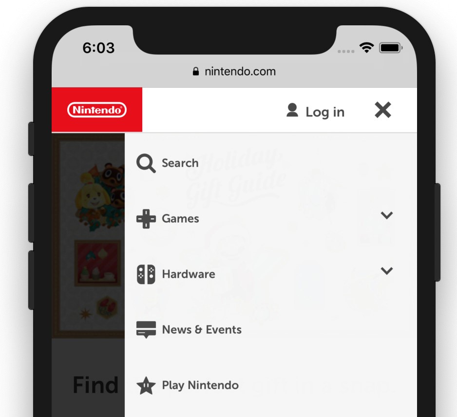
We focused our designs around being mobile first. This was the space we had the most room for improvement. I created a slideout menu that had quick navigation to all the major parts of our site.

A new global nav for nintendo.com and all game sites

We focused our designs around being mobile first. This was the space we had the most room for improvement. I created a slideout menu that had quick navigation to all the major parts of our site.

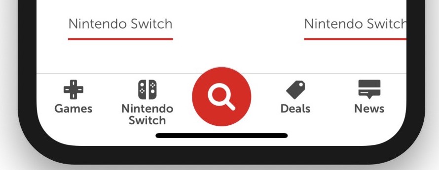
For added mobile usability, I created a floating utility bar at the bottom of the page. It was set up with smart links, so that it could display the most relevant links depending on which page was being viewed.

New mobile utility nav

For added mobile usability, I created a floating utility bar at the bottom of the page. It was set up with smart links, so that it could display the most relevant links depending on which page was being viewed.

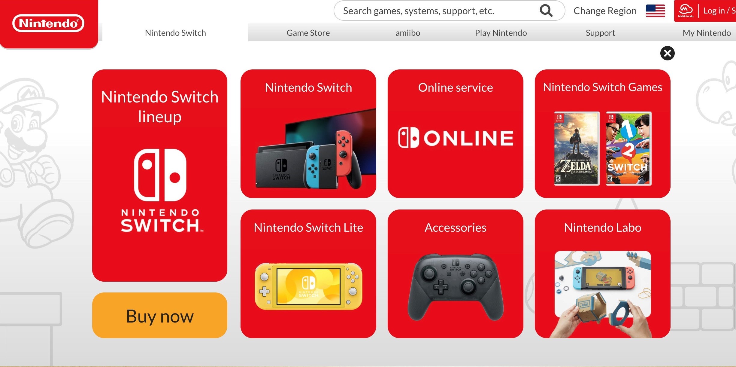
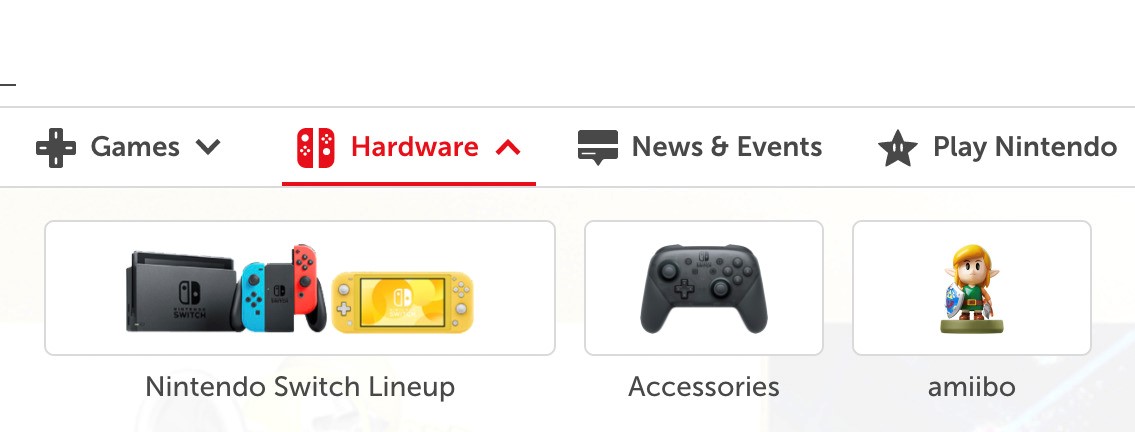
The top nav was kept simple, and had improved accessibility from the old version.

Top Nav

The top nav was kept simple, and had improved accessibility from the old version.

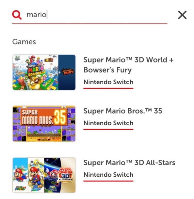
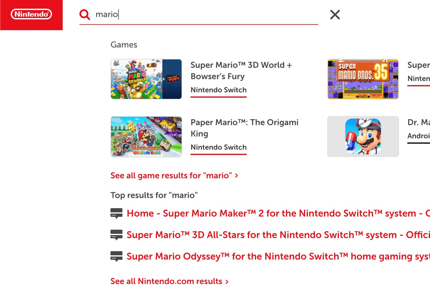
Search was packed full of new features. Using Algolia indexing, I was able to pull relevant results to the search results as a customer types. It also included several results at the bottom for related results like news articles.

Search

Search was packed full of new features. Using Algolia indexing, I was able to pull relevant results to the search results as a customer types. It also included several results at the bottom for related results like news articles.

Mobile search

The new nav was originally set up to launch with Nintendo.com 2.0. I wasn't originally the dev who would be building it, but after the project ran into some issues it ended up on my plate. With only a fraction of the projects time remaining I was able to get it up and running for the launch.
Tight deadlines

The new nav was originally set up to launch with Nintendo.com 2.0. I wasn't originally the dev who would be building it, but after the project ran into some issues it ended up on my plate. With only a fraction of the projects time remaining I was able to get it up and running for the launch.
The old nav was fun and colorful, but had room for improvement. Our main motivation for the new nav was to improve mobile use, accessibility, and personalization.

The old navigation

The old nav was fun and colorful, but had room for improvement. Our main motivation for the new nav was to improve mobile use, accessibility, and personalization.